Advertisers for the Big Game risk missing out on $500B market by ignoring website accessibility
Many people with disabilities rely on assistive technologies to browse the web. This can include screen readers that convert text to speech or keyboard navigation for those who can't use a traditional mouse. When websites aren't designed with accessibility in mind, these tools can't properly read, interpret, or navigate the content, creating frustrating barriers.
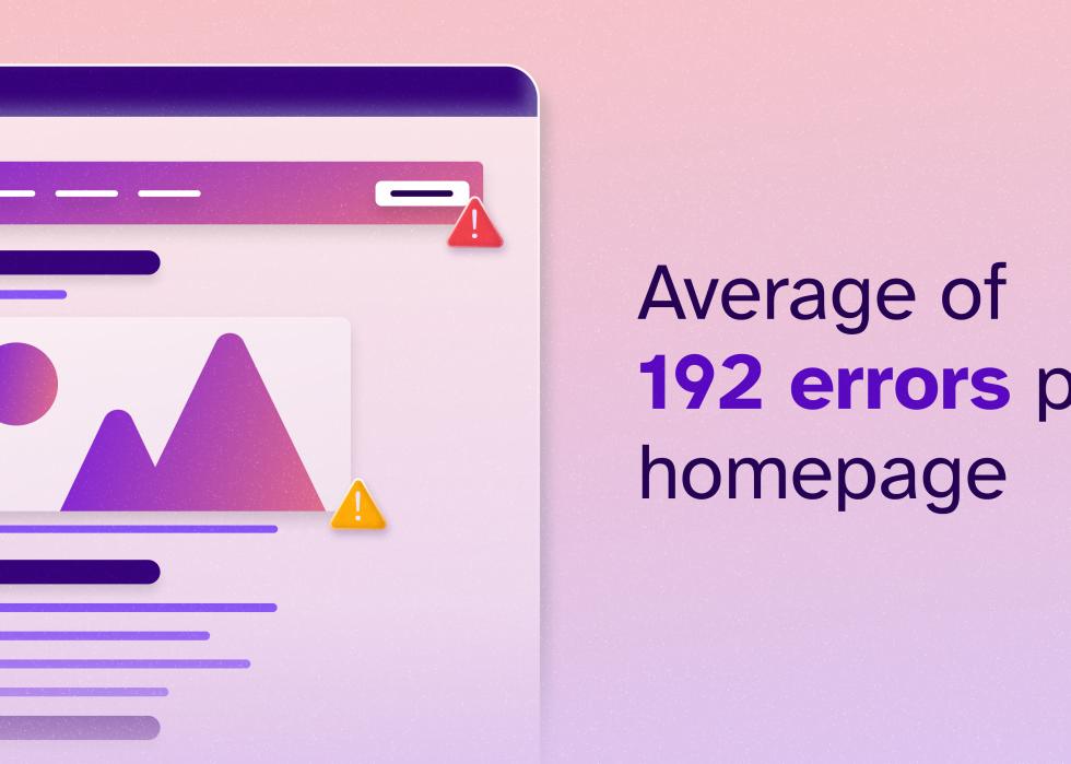
AudioEye's research found an average of 192 accessibility errors per homepage. These issues ranged from poor layout design and missing alt text to non-functional interactive elements—barriers that make it difficult, if not impossible, for millions of people with disabilities to engage with these brands online.
For context, a homepage riddled with accessibility errors is like a stadium without signage. Imagine entering a massive sports venue with no directions to restrooms, concessions, or seating. That's the reality for users with disabilities trying to navigate an inaccessible website.
Penalties
Based on AudioEye's analysis, here are three of the most frequent accessibility issues that brands need to address.
![Infographic showing yellow penalty flag next to text '77% of all accessibility errors fall in layout'.]](https://static.staging.stacker.com/s3fs-public/styles/slide_desktop/s3/2025-02/audioeye-super-bowl-disabilties-2.jpg)
Many websites lacked proper landmarks and headers, making navigation a challenge for screen reader users. The Web Content Accessibility Guidelines, or WCAG, a set of global standards designed to make websites more accessible to people with disabilities, require websites to have an accessible layout to ensure people with disabilities can understand the information and context of the website.
In AudioEye's analysis, testers found that a popular online sports betting platform's homepage lacks clear landmarks (such as a banner and main content sections) and has sections of the page that are mislabeled. This makes it difficult for assistive technologies to properly convey page content and organization, which ultimately creates a confusing experience for the user.
Key information on a site should be accessible at a glance and be designed in such a way that a user gets as much information as quickly as possible.
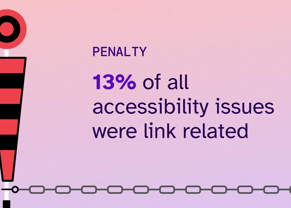
Unclear or mislabeled links created confusion, leading to frustrating user experiences. Accessible links are a persistent issue for most enterprise sites. WCAG recommendations state that users should be able to understand the purpose of each link so they can decide whether or not they want to follow it.
For example, if a link takes a user to a new page, the link description should provide an explanation of where the link will take the user before clicking on the page. This improves their navigation and helps users make informed decisions. Imagine encountering a webpage where every link simply says "click here." Navigating would become frustrating, requiring extra steps just to determine where each link leads.
In one case, a major coffee chain's website featured an unexplained "JetBlue" link in its header, which was meaningless when read by a screen reader. This lack of context disrupts the user experience and can deter customers from engaging further.
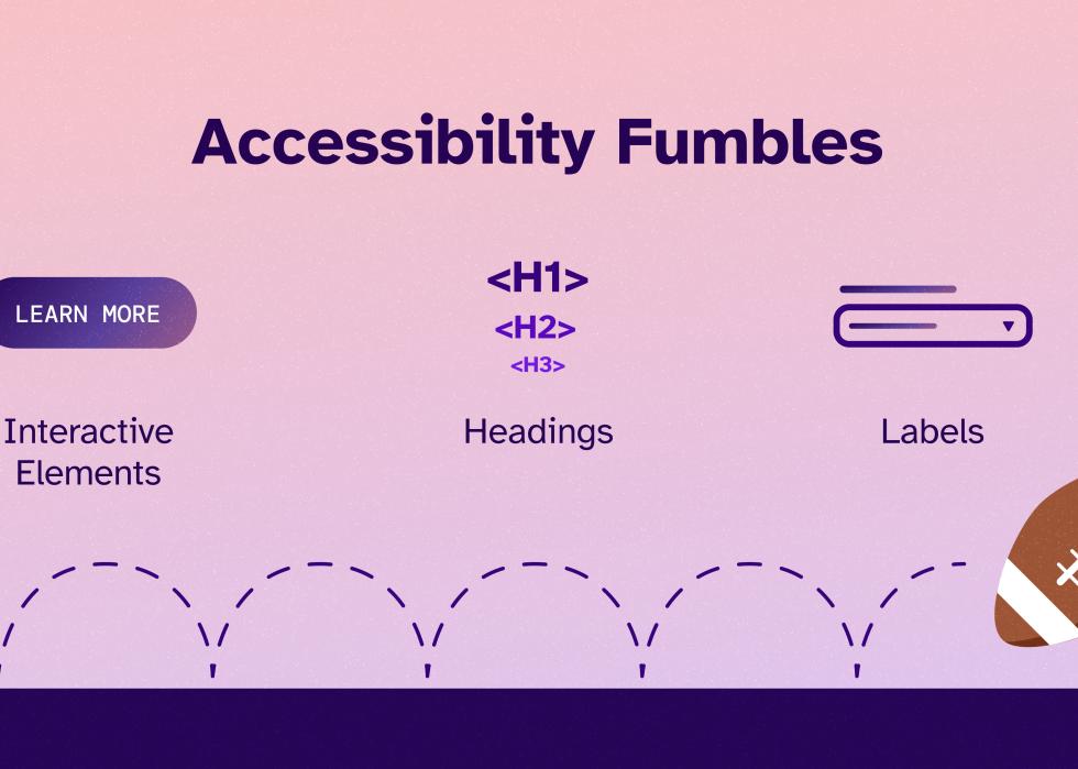
Buttons, forms, and videos without proper accessibility features prevented users from completing key actions, such as signing up or making a purchase.
Similarly, inaccurate headings and labels made it difficult to scan a web page and understand its structure. Testers found that a popular coffee shop had an incorrect heading hierarchy, with the page starting with an H2 heading followed by an H4. This incorrectly conveys to users which content is important, resulting in a confusing experience.
According to WCAG, page labels should be clear and descriptive, and provide guidance and context for people with visual and cognitive impairments. More simply, labels should be included on data inputs (such as forms) to help users understand what action is being asked for. For example, rather than listing a form field as "email," which is not descriptive and does not indicate an action, a description like "enter your preferred email to receive our newsletter" is better.
Each of these accessibility fumbles makes it more difficult for users with disabilities to access brands' sites and complete tasks—including making a purchase. If brands want to increase their earnings and customer base, they need to make website accessibility a priority.
Accessibility Champions
True success in digital accessibility is not a competition—it's a collective goal. Unlike professional sports, where only one team emerges victorious, every company that prioritizes accessibility contributes to a more inclusive digital landscape. Many brands are beginning to recognize the benefits, taking proactive steps to improve user experience, expand their customer base, and foster long-term loyalty. But until the internet is fully accessible to all, the work remains unfinished.
In the end, the real winners are not the companies that champion these efforts but the end users. When people with disabilities can surf the web to the same degree as others, they can have winning digital experiences.